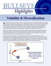
Description
Additionally important to the rise in average correlations is the spread—observing the difference between the highest and
lowest correlated sectors at any given time. If you subtract the highest correlated sector from the lowest, you can determine
the spread between the two (i.e., the spread between 0.90 and 0.60 is 0.30). A wide spread in correlations, also known
as dispersion, makes it easier to identify market leaders and laggards. As the spread narrows, identifying strength from
weakness becomes difficult as everything is moving in a similar way.
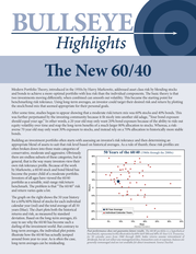
This becomes particularly more difficult in choppy markets where the leaders and laggards are constantly changing. During the microeconomic period of 2003-2007, the higher correlated sectors were in the 0.90 to 0.95 range, but the least correlated sectors were in the 0.50 to 0.60 range. This period had an average dispersion spread of 0.35. During the macroeconomic environment of 2007-2012, not only did average correlations spike, but the range between the highest and lowest correlated sector became very narrow at times.
With an average dispersion spread of 0.18, the difference between the highest and lowest correlated sectors was cut almost in half. Sector Correlation Ranges vs. S&P 500 December 2003 through December 2013 1.00 Macroeconomic Period w/ Narrow Dispersion 0.90 (TBD) 0.80 Microeconomic Period w/ Wide Dispersion 0.70 0.60 0.50 0.40 Dec-03 Correlation Spread 0.35 (Avg.) Dec-04 Dec-05 Dec-06 Correlation Spread 0.18 (Avg.) Dec-07 Dec-08 Dec-09 Dec-10 So far... 0.31 (Avg.) Dec-11 Dec-12 Dec-13 Performance displayed represents past performance, which is no guarantee of future results. Index performance assumes reinvestment of dividend, but does not include fees.
Indexes are generally not available for direct investment. Sector correlations are the 1-year rolling correlation (using daily data) of the 10 individual sectors of the S&P 500 Index versus the index itself (1.00 would indicate perfect correlation). Sector correlation ranges (blue area) are based on the rolling 1-year correlations to illustrate the range of difference between the highest correlated sector and the least correlated sector relative to the S&P 500 Index.
Source: FactSet, calculated by Arrow. SUMMARY: Identifying the leaders from the laggards became very difficult in the macroeconomic period of mid-2007 through mid-2012. In the time that followed, correlations have seemed to widen once again as relative strength strategies began to thrive. There is no way to project the likelihood for future return expectations.
As we all know, past performance is not indicative of future returns, and the future is always uncertain. But as average correlations begin to normalize and the range of dispersion widens, there is certainly an improved environment for relative strength strategies. When the difference between leading and lagging sectors becomes more obvious, there is greater potential to identify and follow trends. Performance displayed represents past performance, which is no guarantee of future results.
All investment methodologies have risks, both general and strategy-specific, including the risk of loss of principal investments. Sector and market data are represented by the performance history of the unmanaged Standard & Poor’s 500 Composite Index and the 10 sectors that comprise the index. Index performance assumes reinvestment of dividend, but does not include fees.
Indexes are generally not available for direct investment. The term “relative strength strategies” is meant to be generic to trend following strategies, not specific to any individual investment strategy or product(s). The information provided is intended to be general in nature and should not be construed as investment advice.This information is subject to change at anytime, based on market and other conditions, and should not be construed as a recommendation of any specific security.
Source: FactSet, calculated by Arrow. AD-062614 .